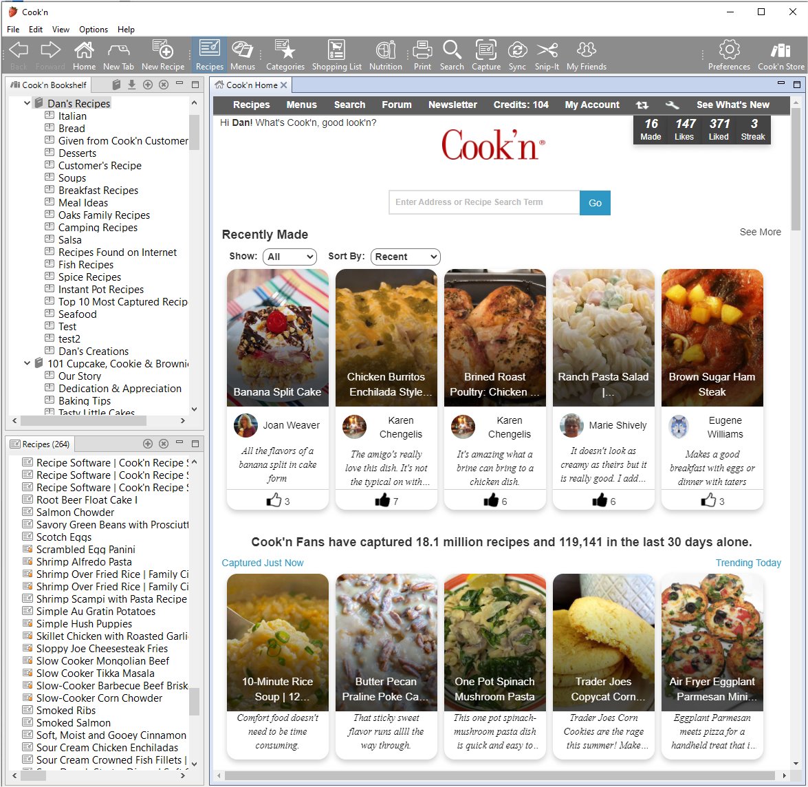
Single Color Toolbar
A few weeks ago, I switched to a single-color toolbar in the Cook'n Desktop App and I'm surprised by how much I have enjoyed the new look & feel.

It seems like, with the Single-Color toolbar, the recipe images on the Cook'n Home Page pop more. The food photos seem more eye catching and appealing with a Single-Color toolbar.
I'm surprised by how much I have liked it. I think that sometimes, it's just nice to have a change of pace.
If you would like to try it for yourself (don't worry...you can always switch back), follow these simple steps:
- Launch Cook'n
- Click Options->Customize Appearance
- Click "Single-Color Toolbar"
To change back simply repeat steps 1 and 2 and then scroll to the bottom and choose "Cook'n 15."
If you try this, please let me know how you like it!
![]() Dan Oaks
Dan Oaks
Founder of DVO Enterprises
Creator of Cook'n
Father of 5. Husband of 1.
Monthly Newsletter Contributor since 2024
Email the author! dan@dvo.com
