If you Find Yourself Drooling on the Keyboard, this is why...
The recipes that you are posting on the Recently Made ticker are amazing! But, I wasn't entirely satisfied with the way we were displaying them in the Cook'n Desktop App. The same goes for the recipes in the Capture Ticker too. Take a look...
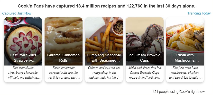
As you can see in this snippet, the name of the recipe appears in white colored text on top of the image. And, in order to be able to see the recipe name, my programmers were placing a gradient black color over the food photo so you could read the recipe name.
In the latest update, I had my programmers place the recipe name below the image and remove the black overlay.
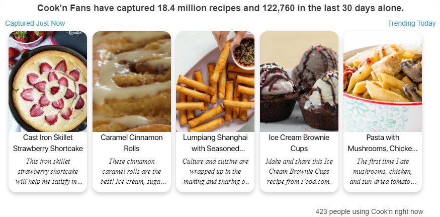
As you can see in this snippet, the food photos are much brighter and much more appealing now.
Here are the two images side-by-side with the "before" on the left and the "after" on the right. Notice how much brighter the image on the right is.
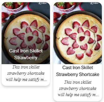
With this side-by-side comparison, you can really see the difference.
As they say in the business..."it's the sizzle that sells the steak!" And, in this regard, I think this change is a big improvement!
The Cook'n Home Page was looking amazing before...and now it looks even better! Your Recently Made recipes have never looked so good!! 😁
So, if you find yourself drooling on your keyboard the next time you use Cook'n...now you'll know why. 😁
![]() Dan Oaks
Dan Oaks
Founder of DVO Enterprises
Creator of Cook'n
Father of 5. Husband of 1.
Monthly Newsletter Contributor since 2024
Email the author! dan@dvo.com